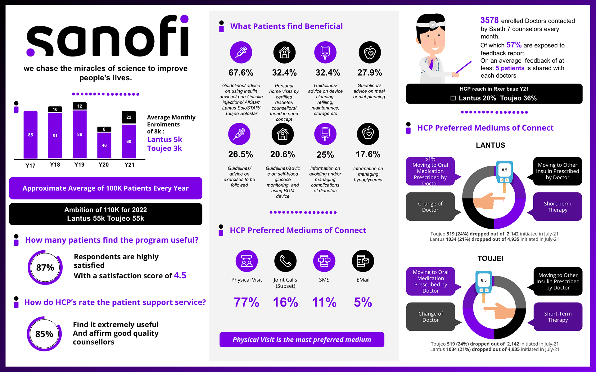
Saath 7 Star Infographic Format: Infographic | Data Visualization Role: Visual Design, Data Interpretation, Research This infographic was developed to visualize key insights from Sanofi’s Saath 7 patient support program. Using raw data from Excel sheets, the design distills complex metrics around patient adherence, satisfaction, and engagement across insulin therapies (Lantus and Toujeo). It highlights trends in dropouts, benefits reported by patients, and healthcare provider feedback, making the data not only accessible but actionable for both internal teams and external stakeholders.